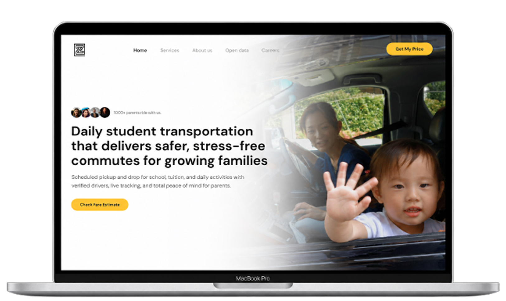
Overview
Zero Moblt is a student transportation service that helps families arrange daily commutes for school, tuition, and other activities. Its service focuses on scheduled transportation, doorstep pickup and drop-off, and a more transparent experience for parents managing their children’s daily travel.
The project involved redesigning the company’s initial landing page into a broader website that could explain the service, introduce the company, and provide dedicated information for different audiences. My focus was on organizing the website, developing the content flow, and designing the key pages to create a more coherent digital presence.
Context
The original website was created quickly during Zero Moblt’s early launch phase. It introduced the idea of the service but offered limited space to explain how it worked, what it offered families, and what the company was building beyond the initial service.
The challenge was to expand the website without making it feel like a collection of disconnected pages. Parents needed to understand the transportation service, while campuses, potential partners, and people interested in joining the company needed to find information relevant to them.
I approached this as both a website redesign and a content-structure problem. The goal was to establish a clear overall structure and create a homepage that introduced the service first, then guided visitors through its benefits, features, and wider purpose.
Visit Zeromoblt.com →
My Role
I was responsible for designing the Home, Services, About, and Careers pages. My work included defining the website’s page structure and navigation, developing the homepage narrative, exploring visual layouts, establishing the UI direction, and creating high-fidelity designs.
I began by reviewing the existing website and product information, researching competitor websites, and exploring design references. I also worked collaboratively with another apprentice designer, Senthil, who designed the Open Data page and explored an alternative illustration-led visual direction. We exchanged ideas throughout the process, while I focused on developing the core website pages and the overall homepage story.
Discovery & Design Direction
I began with the existing website, available product information, competitor research, and visual references. This was desk research rather than formal user research; I did not conduct interviews or usability testing with parents during this project.
One of the main considerations was that the website had to communicate with more than one audience. Parents were the primary audience, but the company also needed to explain its work to campuses and institutions, introduce its broader mission, and present opportunities for prospective team members. I wanted the site to feel appropriate for a service involving families and students while communicating the company’s ambitions as a growing organization.
I explored different layouts and visual approaches before settling on a direction. The process was iterative: I reviewed references, tried multiple compositions, and kept refining the presentation to find a structure that could communicate the business clearly rather than relying on visual appeal alone.
Structuring the Website
I approached the website by considering what visitors needed to understand about Zero Moblt and where they would expect to find that information. I organized the core experience around Home, Services, About, and Careers, giving each page a distinct purpose. The homepage introduced the service and its broader value, Services explained the transportation offering in more detail, About presented the company’s mission and journey, and Careers provided information for prospective team members.
The Open Data page was also part of the wider website, following the founder’s direction and designed by Senthil. This structure gave visitors separate paths to explore the service, learn about the company, and discover career opportunities instead of requiring every topic to fit into one landing page.
Designing the Homepage Narrative
For the homepage, I wanted to tell a story rather than simply list the company’s features. I started with the service and the problems associated with daily student commutes, then moved into how Zero Moblt’s offering works and what families can expect from it.
The page continued with the steps to get started and the capabilities of the Zero app, followed by information for schools and campuses. Testimonials, Open Data, and sustainability content broadened the story beyond the immediate transportation service, before the closing call to action invited visitors to explore coverage and fares.
This sequence reflected my intention to make the website useful to its primary audience without ignoring the needs of other stakeholders. Parents could first understand the service and how it could fit into their daily routine, while campus-related content and the broader company story remained available further down the page.
Key Design Decisions
Make the service clear from the first screen
I explored around seven to eight hero layouts before settling on a direction. I wanted the headline and supporting copy to communicate what Zero Moblt does as soon as someone arrives on the website, rather than making visitors scroll through several sections before understanding the service.
The hero also needed a clear next step. Since a separate web application already handled the process of entering details and checking routes and fares, I proposed directing visitors to that existing application through the main call to action. This kept the marketing website focused on explaining the service and the separate application focused on the next step.
Structure the homepage around a story
I organized the homepage to move from the challenges of daily student transportation to the service, its features, and its wider value. Instead of presenting every capability at once, the sequence was intended to build understanding progressively.
I also made space for campus-related content and sustainability. These sections helped communicate parts of the company’s vision that would not be covered by a homepage focused exclusively on parents. Together, the sections presented Zero Moblt as both a transportation service for families and a company working on a broader student mobility problem.
Choose a visual direction suited to the audience
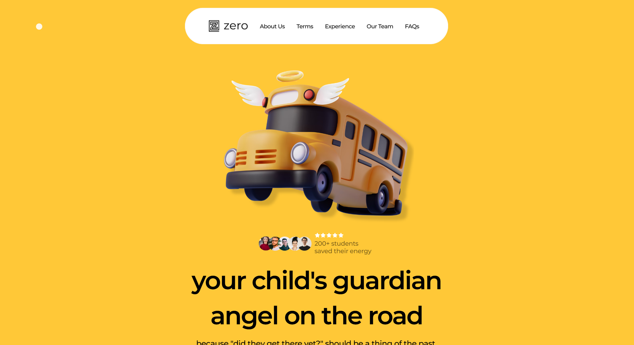
An illustration-led, cartoon-style direction was explored during the project, influenced by the company’s existing visual content. Senthil worked on that alternative, while I continued developing a more professional, product-focused direction.
My reasoning was that the website needed to feel credible to parents, schools, universities, and other stakeholders. I wanted the presentation to communicate reliability and maturity rather than make the service feel primarily aimed at children. This was a design judgment based on the audiences and the nature of the service, rather than a conclusion validated through user testing.
Designing the Key Pages
Services
The Services page focused on explaining the transportation offering in greater detail. It organized information around daily commute needs, service benefits, safety-related practices, vehicle standards, and the process of getting started. This gave visitors a dedicated place to explore the service beyond the shorter introduction on the homepage.
About
The About page introduced Zero Moblt’s mission, the reasons behind the company, and its development over time. It also included the company’s guiding principles, journey, and leadership. I saw this page as an opportunity to give the organization more context and identity beyond the practical details of transportation.
Careers
The Careers page presented the company as a place to work and contribute. It brought together information about the team’s culture, employee benefits, student-focused programs, hiring process, and open roles. This gave prospective candidates a dedicated experience rather than treating recruitment as an afterthought on the main homepage.
Collaboration & Implementation
The work involved exploring layouts, exchanging ideas with another apprentice designer, and sharing the designs for review. The project also highlighted the importance of aligning on expectations and implementation details before a website goes live.
I shared my designs for review, but the published website differed from the intended designs in some visual details, including component styling, typography, and borders. Further refinements to interactions and animations were also not completed in the version I shared for review.
I distinguish the design work from the final implementation because the two are not identical. The page structure and overall direction were carried forward, but some details of the intended experience were changed during implementation.
Final Design
The redesigned website expanded Zero Moblt’s initial landing page into a broader experience with dedicated Home, Services, About, and Careers pages, alongside Open Data. The homepage brought the service, its features, and the company’s wider purpose together, while the other pages provided more focused information for visitors with different needs.
The website subsequently went live. However, the live implementation differs from my original designs in some details, so the screens in this case study represent the design direction I worked on rather than an exact reproduction of the published site.
Reflection
This project taught me how much work goes into turning an early-stage company’s ideas into a coherent website experience. I had to make decisions about the overall page structure, determine what the homepage should communicate and in what order, and explore different visual directions without formal user research to guide those choices. Looking back, I would establish clearer review checkpoints earlier and seek feedback on the content and structure before investing heavily in high-fidelity design. Where possible, I would also speak with potential users to test whether the website communicates the service as clearly as intended. The experience reinforced that designing a website is not just about creating polished screens; it also requires a clear narrative, deliberate information structure, and alignment between design and implementation.