
An Overview
The Zero app is a parent-facing mobile application designed to help families manage and monitor their child's daily transportation.
Parents use the app to:
• Track their child's commute in real time
• Manage attendance and planned absences
• View trip updates and history
• Stay informed about driver and route details
• Manage transportation subscriptions
As the product evolved, it became clear that some of the most important parent interactions could be made significantly easier and more intuitive.
This project focused on improving those core experiences.
Context
As ZeroMoblt prepared to scale its transportation network, improving the parent experience became increasingly important.
Although the Zero app already existed, many transportation updates were still being communicated through WhatsApp groups and phone calls. This created an opportunity to rethink how parents accessed information and interacted with the platform.
What began as a visual refresh evolved into a broader effort to simplify critical journeys, improve visibility, and reduce reliance on external communication channels.
The Problem
Several opportunities for improvement were identified in the existing experience:
• Tracking focused on location but did not clearly communicate trip status
• Attendance relied on hidden interactions that were difficult to discover
• Important information often required multiple steps to access
• The experience depended heavily on users actively checking the app for updates
• Key actions lacked clear prioritization
These issues created unnecessary friction in what should be simple everyday interactions.
My Role
My responsibilities included:
• Auditing existing parent journeys and identifying usability issues
• Redesigning tracking and trip visibility experiences
• Simplifying attendance management workflows
• Improving information hierarchy across key screens
• Exploring proactive notification patterns for trip updates
• Contributing to onboarding and account activation discussions
• Preparing designs for developer handoff and implementation
This project was developed collaboratively with contributions across multiple design directions and explorations.
User & Business Context
Primary users are parents managing their child’s daily commute.
Their key needs:
• Quickly understand what is happening right now
• Ensure their child is safe throughout the journey
• Access important information with minimal effort
From a business perspective:
• Attendance directly impacts transportation planning
• Tracking builds trust and transparency
• Clear communication reduces operational overhead
• Improving adoption reduces dependency on external communication channels
Existing Experience
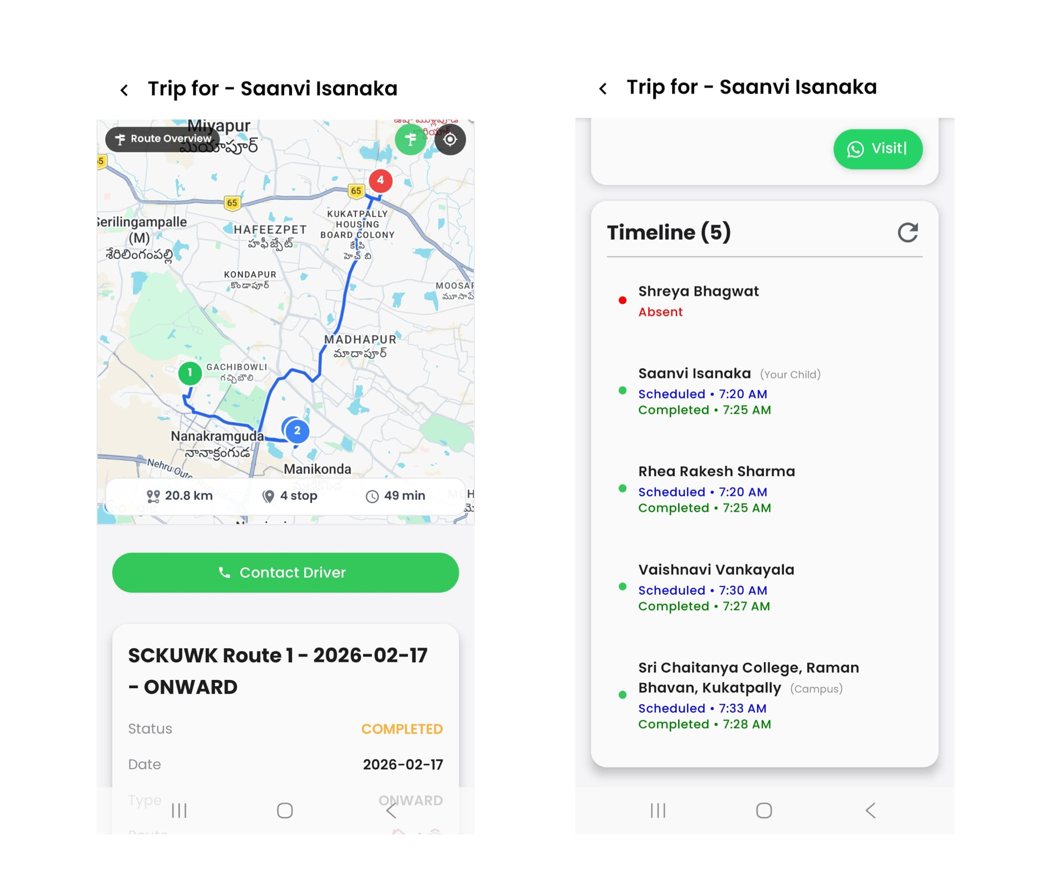
The existing interface provided the required functionality but several interactions were not intuitive. Attendance relied on hidden gestures, tracking emphasized map visibility over trip understanding, and parents often needed multiple interactions to access simple information.
Design Approach
Proactive communication
Parents should not need to repeatedly open the app simply to check whether a trip has started or when a vehicle will arrive.
Inspired by products such as Swiggy and Instamart, notification-driven updates were explored to surface important trip information at the right moment.
Progressive disclosure
Different parents require different levels of information.
The redesigned experience surfaces essential trip information first while providing deeper visibility through detailed trip summaries.
Reducing interaction friction
Critical actions such as attendance management should be simple visible and easy to complete.
State driven experiences
The interface should prioritize what is happening right now instead of presenting all information equally.
Core UX Challenges
Tracking Visibility
Helping parents understand trip status quickly rather than simply displaying vehicle location.
Attendance Management
Transforming a hidden multi-step interaction into a clearer and more intuitive workflow.
Information Prioritization
Ensuring the most important information is visible at the right moment without overwhelming users.
Reducing Unnecessary Interactions
Helping parents stay informed without requiring them to constantly open the application.
Design Explorations
Tracking Experience
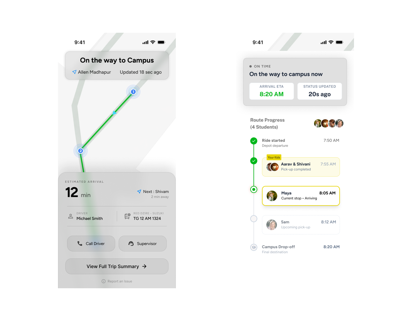
The tracking experience was redesigned to focus on status and clarity rather than map visibility alone.
The goal was to help parents quickly understand trip progress pickup status and current journey information.
Detailed Trip Summary
A structured trip timeline was explored to provide deeper visibility into pickup events delays and trip progression while keeping the primary experience simple.
Attendance Flow
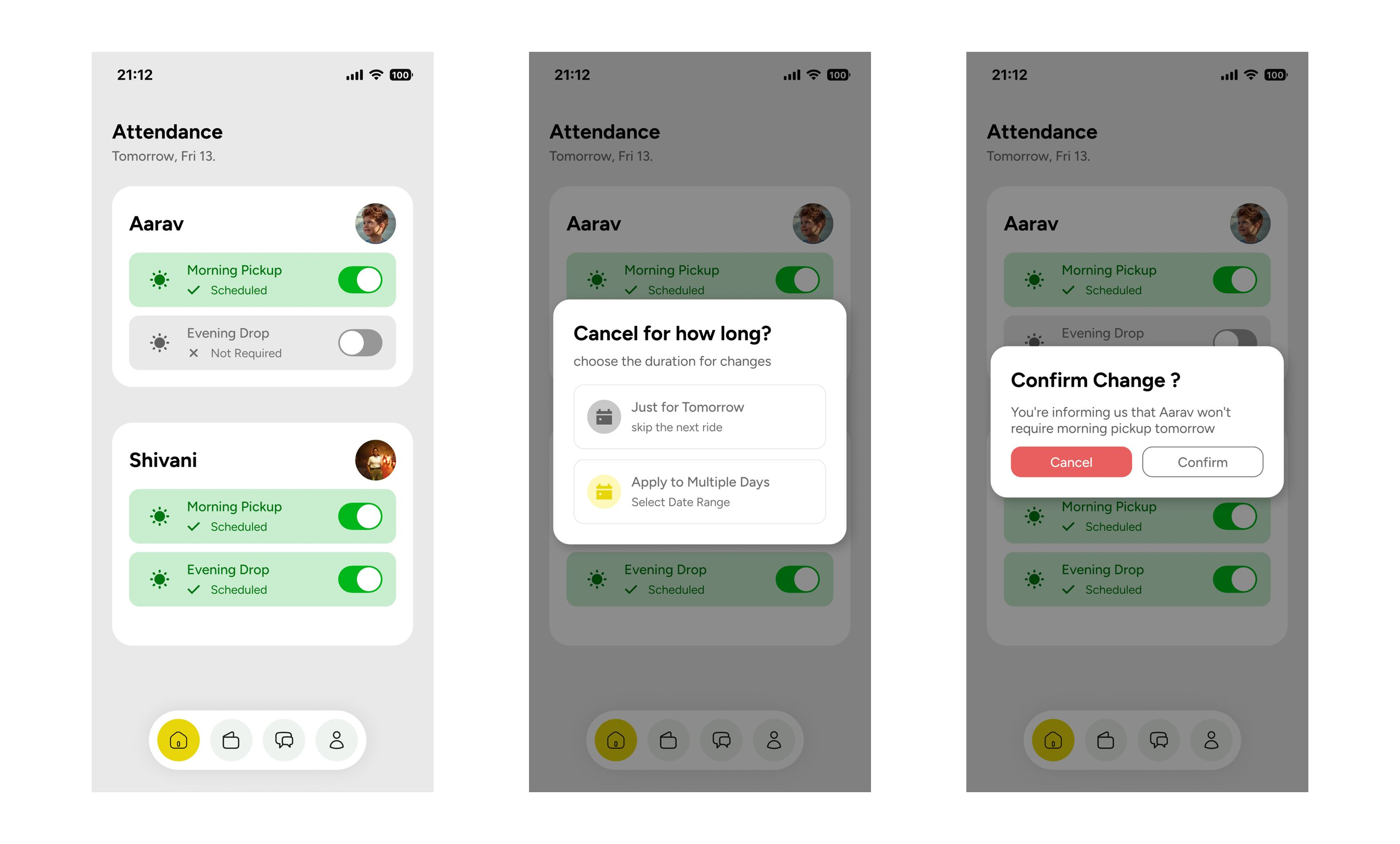
The attendance flow was redesigned to simplify a previously complex interaction.
Instead of relying on long press gestures and multiple steps, a more direct interaction model was introduced allowing parents to manage attendance quickly while supporting both single-day and multi-day absences.
Onboarding Opportunity
Reviewing the parent journey revealed a dependency on external registration flows before users could begin using the app.
As part of the redesign discussions, I proposed integrating more of the onboarding experience within the mobile application to reduce friction and create a more seamless transition from registration to active usage.
Outcome
The redesign was completed and handed off for development.
Several improvements have since been implemented, with additional features continuing to roll out incrementally as the product evolves.
The work established a clearer parent experience focused on visibility simplicity and proactive communication.
Reflection
This project reinforced the importance of designing around user behavior rather than simply organizing features.
It highlighted the value of:
• Proactive communication over reactive interfaces
• Progressive disclosure for complex information
• Simplifying critical interactions
• Designing experiences around user needs rather than application structure
The project also demonstrated how small usability improvements can have a meaningful impact on everyday experiences.