Overview
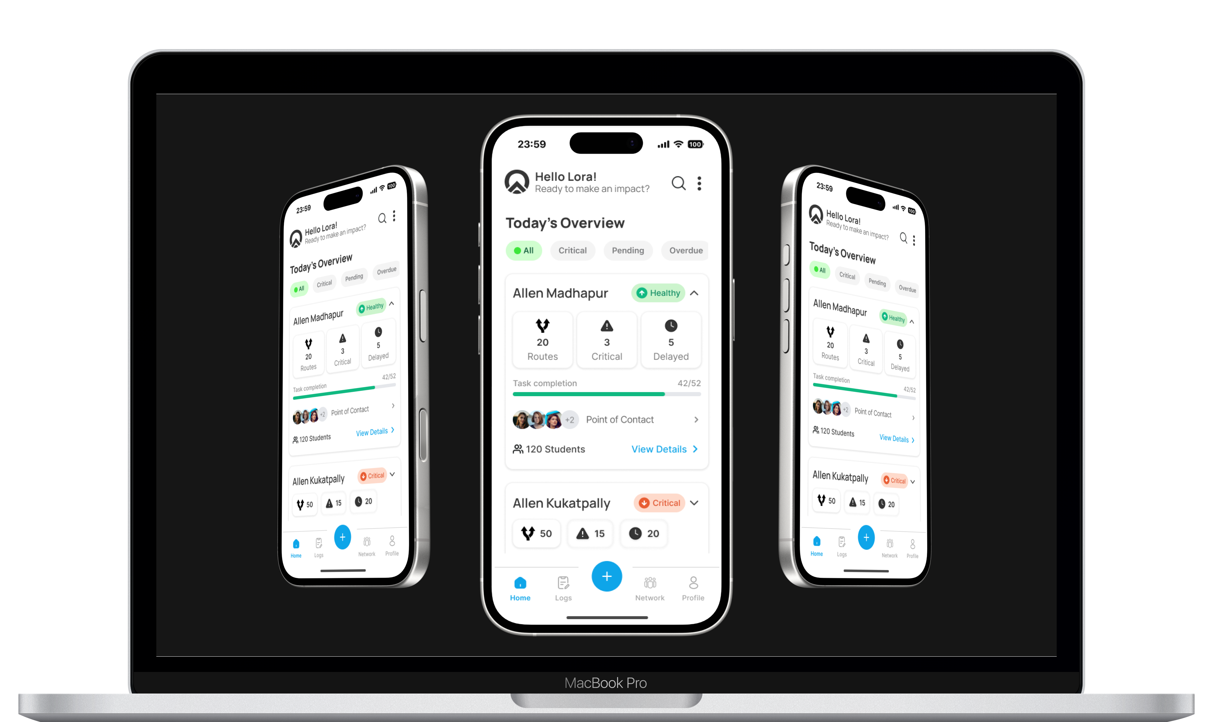
Otime is an internal operations platform designed to help transportation teams manage and monitor student mobility across campuses and routes.
Student transportation operations involve many stakeholders working together — supervisors, vendors, drivers, and operational staff. Ensuring that every student trip runs smoothly requires coordinating multiple tasks across different roles and timeframes.
Otime was created to bring structure and visibility to these operations by converting fragmented workflows into a clear task-driven system.
Context
I joined ZeroMoblt in June 2025 as a Product Designer Apprentice. One of the first projects I worked on was Otime, an internal operations application used by supervisors and operational staff responsible for managing student transportation.
The ZeroMoblt ecosystem consists of three main layers:
Parent App
Used by parents to track their child’s commute and receive updates.
Driver App
Used by drivers to manage routes and trips.
Otime (Operations App)
Used internally by supervisors, vendors, and operational staff to monitor and coordinate transportation operations.
Otime supports the operational layer that keeps the entire system functioning reliably.

The Problem
Before Otime, operational coordination relied on a combination of different tools and manual processes.
For example:
• Drivers often shared their live location in WhatsApp groups
• Parents reported issues through messaging
• Supervisors monitored route status through a web portal
• Operational coordination depended heavily on phone calls and memory
The web portal provided visibility into transportation operations. Supervisors could see information such as:
• active routes
• upcoming trips
• whether a driver had been assigned
• route status
However, operational actions were not structured as explicit tasks.
Supervisors needed to manually monitor the system and remember to perform required actions. As operations scaled across multiple campuses and routes, this approach became difficult to manage.
This created several problems:
• Lack of structured operational workflows
• Delays in responding to issues
• Limited accountability for operational tasks
• Difficulty monitoring system health across multiple campuses
The goal of Otime was to convert these fragmented workflows into a structured operational system where tasks, responsibilities, and issues could be monitored and executed in one place.
My Role
I worked as a Product Designer on the project alongside another design apprentice. We collaborated closely with the founder, director, manager, and engineering team throughout the design process.
My responsibilities included:
• Understanding the operational workflows described in the BRD
• Translating operational requirements into a product structure
• Designing the information architecture and screen hierarchy
• Creating wireframes and high-fidelity interfaces in Figma
• Iterating layouts and interaction patterns with stakeholders
• Collaborating with developers to ensure technical feasibility
The project involved daily discussions with the founder and frequent design iterations to align on the product vision.
Early Challenges
At the start of the project, understanding the system itself was one of the biggest challenges.
The team shared a Business Requirements Document (BRD) that described the operational workflows. However, the document contained technical and operational terminology that was difficult to visualize as a product interface.
Additionally, different stakeholders described the system from different perspectives, which initially made it unclear who the primary users were and how the system should function.
Clarity emerged through repeated discussions and visual exploration.
To help align understanding, we generated early visual concepts and used them as conversation tools with the founder. These visuals helped confirm whether our interpretation of the system matched the intended product vision.
Once we aligned on the design philosophy, the structure of the product became much clearer.
Defining the System Structure
The key breakthrough came when we structured the platform around a hierarchical operational model:
Campus → Route → Task → Action
This structure reflects how transportation operations are organized in reality.
• Each campus contains multiple routes
• Each route has operational responsibilities
• Operational responsibilities are converted into tasks
• Tasks must be completed within specific timeframes
This hierarchy allowed the system to move from high-level monitoring to specific operational actions.
Product Hierarchy
Level 1 — Campus Overview
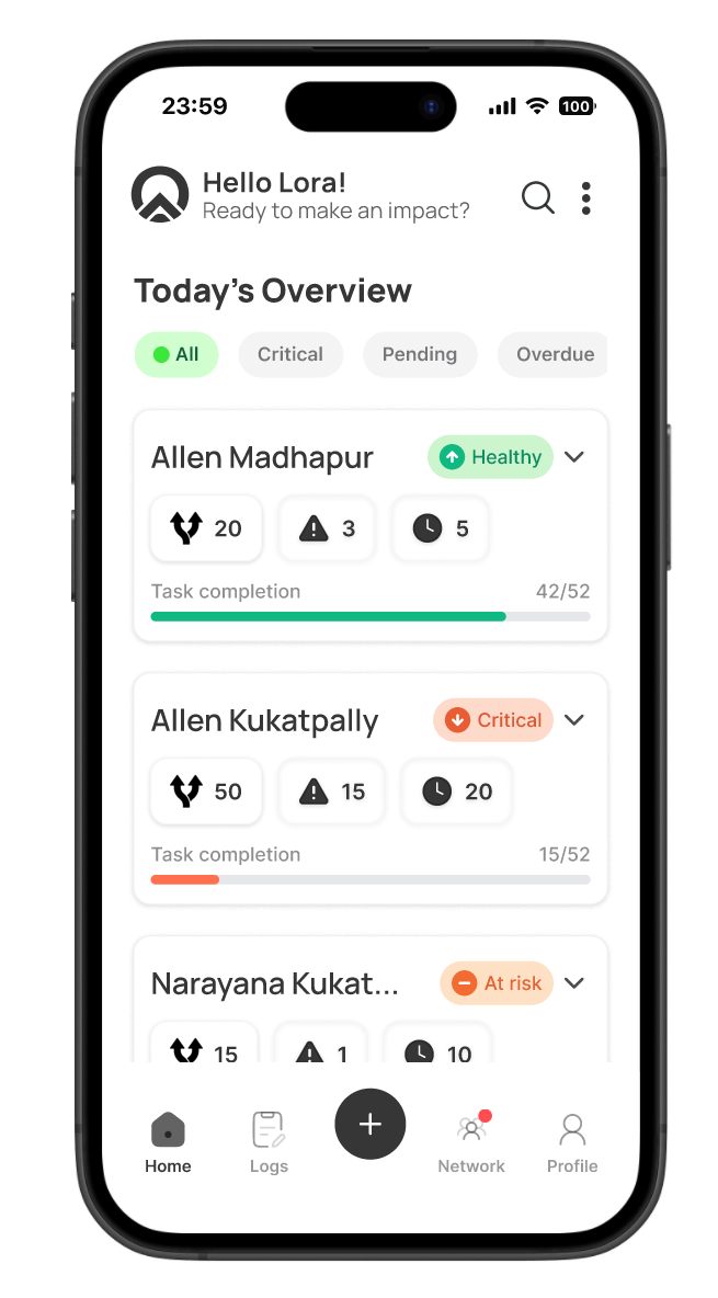
The home screen provides an overview of all campuses the supervisor is responsible for.
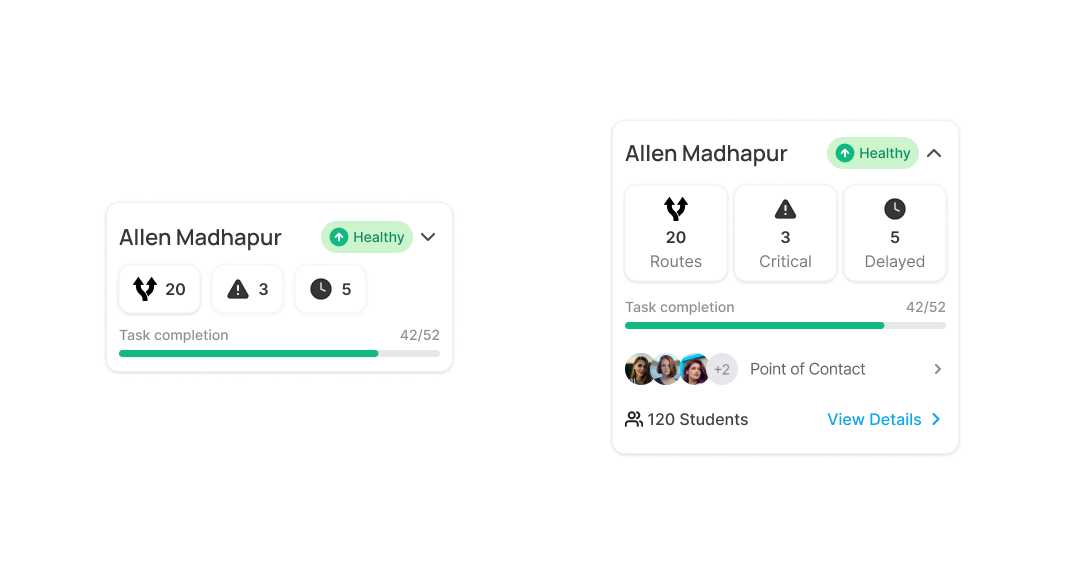
Each campus card displays key operational signals such as:
• campus name
• number of routes
• system health indicators
• task completion status
• operational metrics
This level allows supervisors to quickly identify which campus requires attention.
Level 2 — Campus Operations
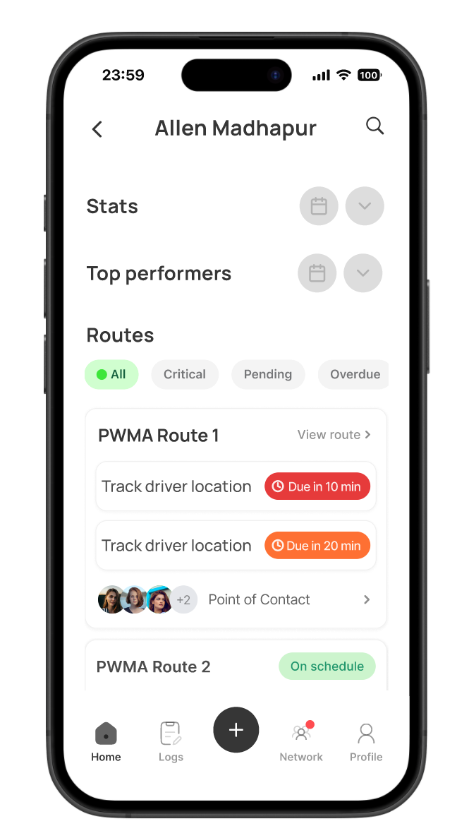
When a campus is selected, the user can view all routes associated with that campus.
The campus screen provides:
• route cards for each route
• operational metrics and analytics
• system health indicators
• quick access to route details
This level gives supervisors a clear overview of the operational status within that campus.
Level 3 — Route Operations
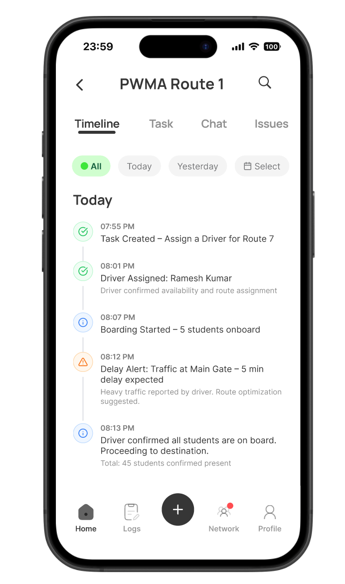
The route page focuses on the operational status of a specific route.
Here supervisors can monitor:
• route timeline and activity
• pending operational tasks
• route status indicators
• issues or delays
This level allows supervisors to identify what actions need to be taken for that route.
Level 4 — Task Layer
Operational tasks represent actions that must be completed by the operations team.
Examples include:
• assigning drivers to routes
• verifying driver availability
• checking route readiness
• resolving operational issues
Each task contains status indicators and urgency signals that help supervisors prioritize their actions.
Core UX Challenges
Organizing Complex Operational Data
Supervisors often manage multiple campuses and multiple routes simultaneously. Displaying all operational data in a single list would create cognitive overload.
The hierarchical structure helped break down the system into manageable levels, allowing users to move from system overview to specific tasks.
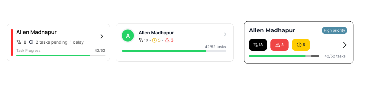
To support this structure, we explored several campus card layouts to determine how operational signals—such as route counts, critical alerts, and delayed tasks—could be surfaced clearly while remaining easy to scan.
Highlighting Urgent Actions
Transportation operations are highly time-sensitive. Certain tasks must be completed within strict time windows—for example, assigning drivers before the next day’s trips.
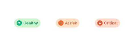
To help supervisors quickly identify critical issues, the interface uses visual urgency indicators such as colored status pills and task tags. These signals allow users to scan routes and immediately recognize which tasks require attention.
Enabling Fast Operational Actions
Operational staff often need to act quickly when issues arise.
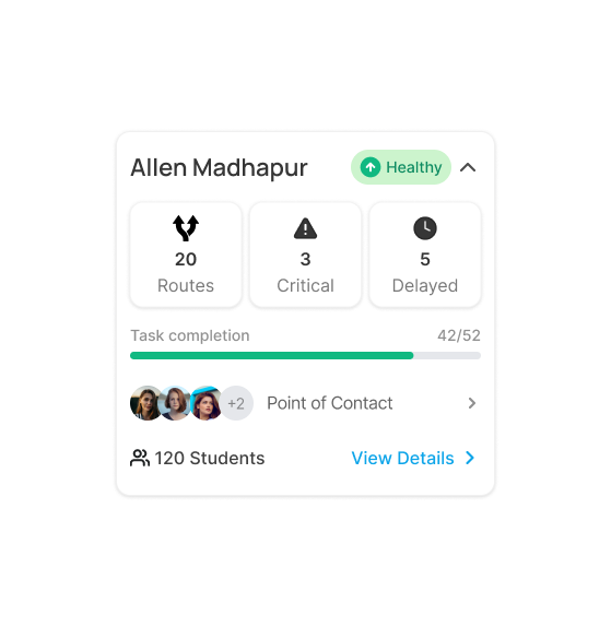
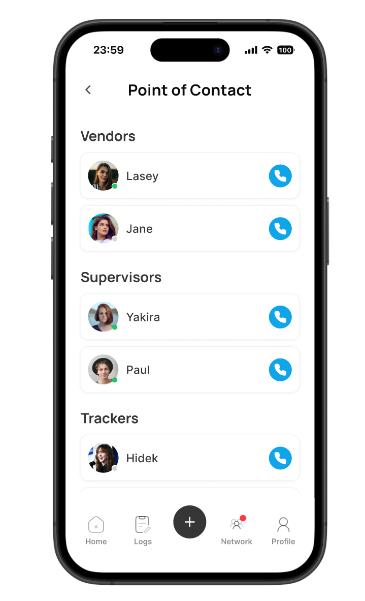
One usability improvement introduced during the design process was displaying driver contact information directly on route cards. Previously, supervisors needed several steps in the web portal to contact drivers.
By surfacing contact information earlier in the interface, supervisors can immediately call drivers when operational issues occur.
Design Iterations
Designing Otime required multiple rounds of exploration and refinement. Because the product deals with complex operational workflows, arriving at a clear and usable interface took several iterations.
During the early stages of the project, another design apprentice and I explored different layout approaches for the core screens. Our goal was to determine how operational information—such as campus status, route health, and pending tasks—could be presented clearly without overwhelming users.
We regularly reviewed these concepts with the founder, who provided feedback based on how supervisors actually manage transportation operations in the field. These discussions helped us understand which information needed to be surfaced first and how the interface should support fast operational decisions.
Over time, we combined the strongest ideas from both design approaches and refined the layout and information hierarchy. Particular attention was given to the campus cards and route dashboards, since these screens needed to highlight urgent tasks, route status, and system health.
Through multiple iterations and continuous feedback, the interface gradually evolved into a more structured and operationally focused design that aligned with the real workflows used by the team.
Typical User Flow
A typical operational scenario looks like this:
- Supervisor opens the app
- Checks campus overview for system health
- Identifies a campus with pending tasks
- Opens the campus to review routes
- Selects a route with unfinished tasks
- Opens route details
- Completes the operational task (for example assigning a driver)
This workflow repeats throughout the day as new tasks appear or issues arise.
Key Learning
This project taught me that designing products in early-stage startups is highly iterative.
Instead of a linear design process, the workflow involved continuous discussions, prototypes, feedback cycles, and refinement.
Because the product addressed a complex operational problem, many design decisions needed to be developed from first principles rather than existing design patterns.
The experience reinforced the importance of designing systems that prioritize clarity, usability, and operational efficiency rather than focusing purely on visual aesthetics.
Outcome
The final design translated a complex operational concept into a structured interface that allows supervisors to monitor campuses, manage routes, and execute operational tasks efficiently.
By organizing the system into a clear hierarchy and surfacing critical operational signals, Otime helps transportation teams maintain visibility and respond quickly to operational issues.